
In an attempt to increase sales, I’ve been fiddling with my product boxes, and thought readers might be interested to see what I’ve done.
But first, the problem: In this case, sales were low, and my new theory is that shoppers get most of their information about product simply from the visual on the box cover.
In the past (and currently) I’ve tried live demonstrations, which are pretty much mandatory for moving particle effects that cannot be properly shown on any box picture. I’ve also tried notecards: every box at my shop delivers an explanatory notecard upon touch.
But the images on my boxes were previously quite simple, having only an action shot and the product name. It occurred to me that the nature of the product was not clear by merely looking at the old boxes. You had to either run the demonstration or read the notecard to "get it". I believe the demo and notecard are extra steps that some shoppers wouldn’t bother to do, and that they’d rely only on the box image.
My strategy was to replace the box images with something much more informative. But what to put on them? Here’s what I did:

- Consistency: Every single box has exactly the same style, size, fonts, layout and colors. The idea is that once people get familiar with one box, they will much more easily read other boxes. This is the same way grocery products are labeled.
- Information: The familiar “i” icon can be touched for immediate delivery of an informative notecard. If shoppers don’t recognize the “i”, it says “Click for Info!” as a reminder.
- Quantities: The number of prims and objects is stated. While this doesn’t make much sense for particles, which are most often a single invisible prim, shoppers often ask this question. Answer it here before they can ask.
- Permissions: Another question that is frequently asked is the object’s permissions. Unlike clothing or skins, particles are often sold as Transfer, no-copy.
- Description: This is a very important feature, I believe, as it may be the only way some shoppers find out what the item actually does, because it is faster than reading a notecard. The trick is to clearly capture the essence of the product in as few words as possible.
- Colors: I used colors to help people understand the permissions scheme, with green and red helping to convey the meaning.
- Titles: While the product name is an obvious inclusion, it should be prominent and not confused with anything else. Also, I've added my store name as a bit of extra advertising.
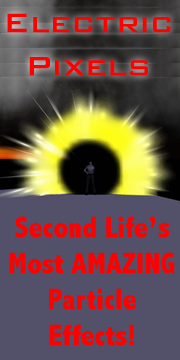
- Image: The most difficult feature is the image, as it must carry a vision of the product at a glance, much like a book cover. The image has to accurately portray the product in a setting that matches the product’s intent. The background must complement the product, and the viewing angle, model's "look" and model’s pose must also match the theme. This turns out to be fairly difficult to do, and took me the most time to do. Above you can see an image of one of my particle effects that tries to show the feeling of the product's motion in a still frame. These are very hard to do.
- Price: I did not put the product price on the box, even though this appears to be a common practice. My reason was simple: once on the box, you kinda have set the price permanently, unless you redo the box texture and upload again, at your cost. Imagine trying to have a sale where all 200 products suddenly must have new textures! In any case, the price is available by simply mousing over the box.
- Language: You’ve probably noticed that all wording on the boxes are written in English, yet many customers speak other languages. I debated whether to have multiple box covers, but in the end felt that it was far too much work to do, and the information portrayed would be much greater than before in any case. It's my belief that most people are accustomed to seeing English products - and my monitors tell me that by far the majority of visitors to the store have set English as their language.
- Fractional Textures: It’s possible to save a bit of money by creating textures that hold 4 box images in a 2x2 matrix. You could, for example, fit four 512x512 box images into a single 1024x1024 texture. By adjusting the offsets on your boxes, you can display the desired image only. This could save you 75% of your upload costs, and visitors would have a simplified texture rez experience (fewer, but larger textures to load). I didn’t do this, but could have if I had the time to do so (it’s more work to do this). One issue with this approach occurs when you need to change one image - you might end up redoing the other three, or at least must keep track of several versions of the multi-texture.
![Reblog this post [with Zemanta]](http://img.zemanta.com/reblog_e.png?x-id=b9a8eaad-460a-4498-9eb0-7c30c1f854e5)

 virtual business, building virtual products and exploring the virtual world.
4 comments:
Great article about designing boxes that give info to your customers and I am pleased to hear that sales are picking up as that is what good design is supposed to do.
For next time, as a hint (I was trained in graphic and web design for what that is worth)you might want to think about people who are colour blind (about 10% of the population) and particularly those that are red-green colour blind. There are articles online about designing webpages with this in mind which can be easily applied to packaging in second life.
People underestimate the importance of good graphics so it was with pleasure I read your piece.
I find it hard to read red text on a black background. Maybe I'm just weird.
Right-on!
You are following the platinum rule of all universal business: "Make it easy as possible for anyone to give you their money".
And this refers more toward the mental and "brainwork' part of the shopping experience as much a sto the "pgysical access".
Sweet!
Eeesh the old dyslexia kickin'-in. Sorry about that heheh
Post a Comment