I’ve added some new items to my store in the past few weeks, taking up more space on the product shelves. In fact, a count today revealed that I now have 196 unique products for sale. I’ve talked before about how I arrange the product shelves for shopping ease, but today I want to talk about extra features that every store should consider having.
The issue is that when you have a great many products, things can be confusing for visiting shoppers. Where do they start? What’s different from the last time they visited? What’s it all about, anyway? Over the past year I’ve developed a few solutions for my shop; they may work for you too.
Problem: How do customers find new items? At first I would simply place a “NEW” sticker onto the appropriate product boxes. That was fine when the number of products is low, but as the number rises it becomes increasingly difficult for customers to make their way through the entire store to find those shiny new items.
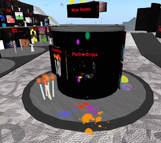
Solution: New products are displayed in an area specifically set aside for that purpose. Of course, it should be visible immediately upon arrival to the store. I’ve made such a display at Electric Pixels in Kiosk form. I automatically know when to clean it out, too – whenever it runs out of space for new items, I clean out the older ones.
Problem: How to deliver custom-made items to customers? One can, of course, have them pay you directly and then you hand over the item. But that method can screw up in various ways, not the least of which is incorrect payment amount.
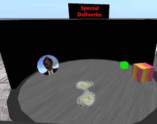
Solution: I’ve created a “Special Deliveries” area, in which I place one-time product boxes containing special orders. I set the floating text to the name of the customer and also set the box for sale at the agreed upon price. A quick IM to the customer leads them to come by and “pick it up” (which really is “buying” it.) This ensures that your transaction log shows more detail than “Give Inventory”. A side benefit of this approach is that while they’re in your store, they just might buy something else, or perhaps bring someone else along with them.
Problem: Depending on the season, there’s different combinations of products that go together. For example, during Halloween you might want scary Vampire items alongside with falling leaves. Or at another time you might want Christmas and winter items placed together. Either that or you force your customers to thread their way through your shop looking for them. Except that they won’t, and you lose the sale.

Solution: Recently I built a “Seasonal” area in which I can display different combinations of products throughout the year. (That is, if I get off my can and actually move stuff around – note expired Halloween items in photo. Sheesh.)
Problem: Visitors are not sure what to do with your products.
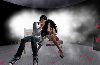
Solution: My solution is to build a demonstration area, where I can display interesting combinations of products. It’s not selling anything directly, but instead the purpose is to stimulate the imagination of the customer, which may lead to purchases they wouldn’t have made otherwise. (Pictured: Eureka Dejavu and myself, testing the demonstration area.)
Problem: Visitors don’t know much about your store.
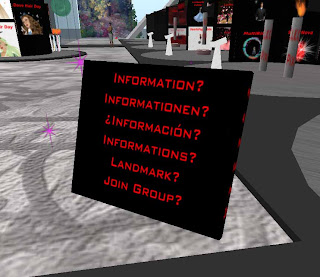
Solution. You could use one of those accursed Landmark givers, but I don’t like their intrusiveness when I shop, and I suspect my customers don’t like them either. Instead, I’ve built an all-in-one gadget that upon a click offers a landmark, group join, explanatory notecards in multiple languages and a link to the website, too. It also tracks visitors and emails reports periodically.
You can see that a store is not simply just a pile of products pasted on a wall or laid out on the floor. I’ve tried to make the shopping experience as simple as possible. You can too!


 virtual business, building virtual products and exploring the virtual world.
5 comments:
Great post.
Question about the special deliveries area - how do you keep someone else from coming along and buying the product? If it was supposed to be a one-off with pricing accordingly, wouldn't that irritate the customer?
Cheers.
Wide circle is a social media networking that delivers your ads to a large number of websites.
=============
Britney
Social Bookmarking
Not too hard to make a vendor script that is tailored to one specific person..
Well, ArminasX, I hate to say it but I still find your shop confusing. The major problem I identified is that the landing spot is too far from the merchandise, so you don't get a clear overview, and some of the farthest away boxes do not even get drawn due to LOD issues. Also the large number of large textures make for a rather fuzzy appearance at first. One solution to this would be for example to combine the headlines on a single texture, and preload that one in th landing area. Another suggestion would be color coding of the single booths. This could be combined with color coded arrows and/or teleports in the landing area.
What I always liked in your shop was the preview statiton in each booth. The newer areas - seasonal and "new kiosk" are pretty good.
@Peter - yes, I have been concerned about the same things, but there are always trade-offs. I set the landing spot such that you can view the entire store, all shelves, all levels in one go. However, as you say, there are well over 200 textures to load all at once and it can be a while before it becomes clear. The alternative is to visually chop up the store into different areas that could make it more confusing to navigate. Or, as you say, somehow combine textures and use color coding. I will look into that one. Thanks!
Post a Comment